The Logo Campaign
 By Mark Kaufman
Happy President’s Day. On this auspicious occasion, a day off for most Americans, I want to roll out critiques of the various 2008 presidential contenders. Inspired by the famous Paula Scher editorial in the New York Times during the 2004 beauty contest, I will be looking at the way the “contenders” of both major parties brand themselves. At one point when there are 2 candidates left standing (sorry Ralph Nader), the brand mark is sure to change when a running mate is chosen, so we will address the head to head match up then.
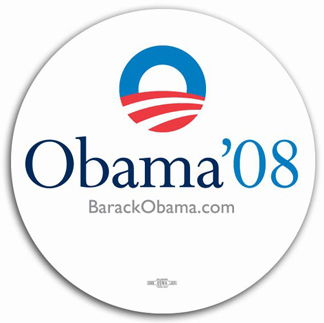
What prompted me to think about doing this, besides the fact that I am a logo nerd, was seeing the Barack Obama logo for the first time last week. As a logo nerd it certainly did make me sit up and take notice, it is unusual to have something more than a word mark to brand a candidate, I know that former Iowa Governor Tom Vilsack also has a bug + wordmark, and I will address his brand at a later date. I figure I would start off with Obama. I love the logo, I find it to be bright and open, strong and simple, and the use of the round sans-serif O invites the viewer in, asks us to go along for the ride. Another nice touch is the use of the red and white stripes from the American flag as both the landscape of the country and a horizon line, again offering us something far off in the future, a bright, white, clean future perhaps? The interesting thing I find about the O device is that there are no straight lines, no right angles, no sharp edges, yet it is bold at the same time. It also strikes me that much like the candidate himself, the O is an empty vessel, allowing the viewer to see what they want in Obama, most have a positive view of the man, although they don’t know why. Therefore the empty vessel can be filled with hope and optimism and a new day. Those that don’t like the candidate, although they too are unsure why, will probably get the feeling that there is no “there”, there, it’s pretty to look at but in the end says nothing, and stands for nothing.
As far as the word mark is concerned, I’m not so sure. Yes, the serif typeface is a nice counterpoint to the bold O, but I feel it looks weak. It is also another example of Democrats over thinking things. The big thing I have a problem with is the apostrophe before 08. Sure it’s proper English, the correct thing to do, but it seems unnecessary. It seems that the majority of Americans will see it as yet another liberal, wine drinking, effete Democrat that thinks they’re smarter than me. The John Kerry, Al Gore syndrome all over again. I would suggest that they ditch the apostrophe in order avoid making people uncomfortable with their poor punctuation skills. Obama probably is smarter than most Americans, but would you have a beer with some pointy headed English major? I think not.
Finally, although I love the Obama branding effort, I have a problem with it. As a designer it seems that most of the things that I and my ilk respect, from logos, to films, to television shows, books, ad campaigns, packaging, etc., are disliked by the majority of the public. Conversely, things such as the AFLAC duck, celebrity gossip, NASCAR, reality shows, the Donald, the things that Americans, absolutely, positively LOVE, I can’t stand. I’m afraid that the Obama logo is too damn good for its own good.