Hey That’s Cool. No, Wait That’s Crap!

By Mark Kaufman
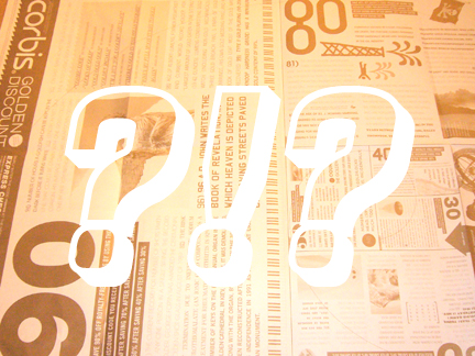
I got a big poster from Corbis the other day touting some kind of Golden Discount. Beats me what the hell this offer is. This is one of those “Design for Design Sake” pieces. On first glance it looks oh so cool, but on second glance, the one where you stop to actually try to understand what the piece is intended to inform you about, it is an absolute disaster! Numbers, and copy blocks going every which way, 90 different typefaces, all shouting look at me, look at me! And signifying nothing. I added the question marks and the exclamation point to this photo which neither adds nor subtracts to the legibility of this poster. I might as well have added a kitchen sink to this mess. Come on Corbis, you can do better.
