Chart Power
By Mark Kaufman
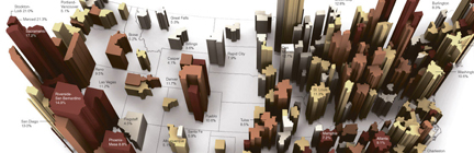
As usual, spent this past Sunday morning drinking coffee and lazily thumbing through the New York Times (before spending the rest of the day cleaning out the basement). And as usual lately I was absolutely stopped dead in my tracks by a graphic in the paper. This was a stunner, a 3D map graphic charting out foreclosure rates across this great land of ours, beautifully rendered, and immediately impactful, this is one of the finest examples of the power of information graphics. In fact it is a powerful example of information graphics taken to another level of clarity and meaning. If you click through to the graphic online you can see how the standard flat map renderings at the bottom of the page while informative, pale in comparison to the large 3D map and its almost instantaneous ability to force you to see a problem with a new depth of understanding. Bravo.